In what ways do your media products use, develop or challenge the forms and conventions of real media products?
http://padlet.com/clairehlewis10/zd9ndoz9nt
Sunday, 2 April 2017

Wednesday, 15 March 2017
Homework
You need to complete a research post into page furniture found on double page spreads. You need to find examples, preferably from music magazines and construct a blog post explaining what they are, what purpose they serve and include a screenshot of them.
Refer to the blogpost below on page furntiture to help you.
Hand in date Thursday P3 16th March
Refer to the blogpost below on page furntiture to help you.
Hand in date Thursday P3 16th March
Monday, 6 March 2017
Homework
You need to write the article for your double page spread for your magazine. It should be written accurately and should be written directly for the target audience.
It could be an interview with a band or artist, it could be a Q&A feature, it could be a 'getting to know the artist' feature.
It needs to be drafted and posted onto your blog by next Monday's lesson. 13/13/17.
Do some research into existing examples to prepare.
It could be an interview with a band or artist, it could be a Q&A feature, it could be a 'getting to know the artist' feature.
It needs to be drafted and posted onto your blog by next Monday's lesson. 13/13/17.
Do some research into existing examples to prepare.
Sunday, 5 March 2017
Double Page Spread examples to look at…..
The DPS is the hardest product to construct.
It relies upon using the same house style you have developed with your front cover and contents page.
It needs high quality photography.
It requires subtle use of page furniture.
All combined with excellent visual syntax achieved through high quality page layout, design and composition.
Oh, as well as a well-written article to accompany it!
There is a lot to do so you need to start preparing now.


T
It relies upon using the same house style you have developed with your front cover and contents page.
It needs high quality photography.
It requires subtle use of page furniture.
All combined with excellent visual syntax achieved through high quality page layout, design and composition.
Oh, as well as a well-written article to accompany it!
There is a lot to do so you need to start preparing now.


T
Research and Planning of Double Page Spread
1. You need to identify the codes and conventions of DPS design and layout.
2. You need to do an analysis of an existing Music magazine DPS.
3. You need to produce 6 layout plans for ideas for your music magazine DPS.
4. You need to identify examples of page furniture found on music magazine DPS. Use screenshots from existing magazines to illustrate this. (see the images below to help you)


Tuesday, 7 February 2017
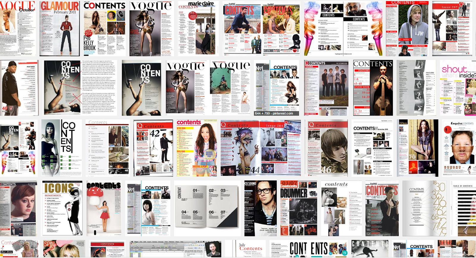
Grade A contents pages
You want a grade A? Then this is how to do it.
Look at these contents pages.
They use all the key elements we have discussed in class.
How can you learn from these?
What can you pick out and use in your own ideas and final designs?
Can you copy the layout of one of these examples?

Monday, 6 February 2017
Contents page conventions
Contents pages are designed as a reference to what is in a magazine. They provide a brief overview of individual articles & features, some of which might be regular additions for every edition.
The design and layout are based upon a grid structure that you must follow. You must use rulers and gridlines to construct your ideas.
1. They usually include a contents banner at the top of the page. The masthead is also usually featured along with the date, issue number, web address and social media information.
2. They have 1 or 2 columns of text which have sub-headings such as NEWS, REGULARS, FEATURES, REVIEWS, LETTERS, etc..
3. They use numbers to indicate the page location.
4. They incorporate photos of the content with numbers and captions to provide anchorage, (creates a sense of meaning for an image). The larger the photos the more important that article is.
5. Each article/ feature heading is in a larger/ bolder font for emphasis.
6. There is blurb underneath each heading which is smaller and gives an indication of the content for that feature/ article.
7. There is often an editor's letter. There can also be a callout box with magazine subscription information.
The use of the text needs to be considered for emphasis and also needs to be a suitable size. As a guide no larger than 24pt. No smaller than 10pt. If in doubt print and check.

The design and layout are based upon a grid structure that you must follow. You must use rulers and gridlines to construct your ideas.
1. They usually include a contents banner at the top of the page. The masthead is also usually featured along with the date, issue number, web address and social media information.
2. They have 1 or 2 columns of text which have sub-headings such as NEWS, REGULARS, FEATURES, REVIEWS, LETTERS, etc..
3. They use numbers to indicate the page location.
4. They incorporate photos of the content with numbers and captions to provide anchorage, (creates a sense of meaning for an image). The larger the photos the more important that article is.
5. Each article/ feature heading is in a larger/ bolder font for emphasis.
6. There is blurb underneath each heading which is smaller and gives an indication of the content for that feature/ article.
7. There is often an editor's letter. There can also be a callout box with magazine subscription information.
The use of the text needs to be considered for emphasis and also needs to be a suitable size. As a guide no larger than 24pt. No smaller than 10pt. If in doubt print and check.
Subscribe to:
Posts (Atom)