Thursday, 8 December 2016

End of term progress check

Check the progress tracker to see what you need to complete to avoid catchup next Thursday.

Remember everything from the challenge target column to the coursework autumn grade column needs to be green.  Some of this is because you have started and not finished the post or just not uploaded it to the blog.

Time to get organised and get things sorted please....

Remember to see me when you have completed something so I can turn it green and update the tracker. 


Monday, 5 December 2016

Target audience homework

You now need to identify who the intended target audience is for your music magazine.

You need to identify what age range they fit into.  15-24, 25-35, 36+  or does your magazine appeal to more than one group?

Explain what gender breakdown they are in terms of the percentage ratio and why.

Explain what they are interested in doing in their spare time, where they shop, how they dress, what products they own or aspire to own.  How do they listen to music, do they buy music?  What format?  Do they stream music, what service do they use?  What social media platforms do they use?  Do they attend music events such as gigs or festivals? Which festivals? Who are their favourite artists/ bands/ genres of music?

You should also identify which socio-economic group or groups they might belong to using the JICNAR scale below
.

Do elements of your target audience belong to particular social groups, what ethnic groups might they belong to?

Create a detailed profile of who your intended target audience is and post on your blog for our next lesson on Thursday.  

Monday, 21 November 2016

Photo shoot planning

Now that you have started to produce the mock-ups for your front cover you need to begin planning for the photos that you will need to take for the front cover in your own photo shoots.  These photos will need to feature people that will be convincing as musical artists. They will also need to feature props and costumes that will make them look relevant to a music magazine.   You will need to consider the location and how to light that location. Using a white sheet as a backdrop can be an effective tool to create the illusion of a photography studio.  You will need to try a few ideas for camera shots and try different costumes and looks.  You should aim to take 3 different approaches that you can then develop into mock-ups.  You should take many more photos than you need.  

Use the template below to help you plan these photos.


Tuesday, 15 November 2016

Homework

To complete 6 layout ideas for the front cover of your music magazine.

These need to be different to the designs you produced for your school magazine.

Please complete and upload to your blog for Tuesday 22nd November.

Mock-up for front cover of your music magazine


We are now going to start generating some mock-up ideas for our front cover for the music magazine.  Using a photo of a music artist that we source from google images we are going to layout the information for the front cover to follow the key conventions.  Select an appropriate font, colour and house style to suit the sub-genre of your music magazine. Make sure that you experiment and try things out.  When finished uploads the ideas to your blog.


Monday, 7 November 2016

NME brand identity, ideology and Q magazine


Developing a Brand Identity and Brand Values for your music magazine

All of the magazines featured on this blog have a very distinct and definitive brand identity.

Brand identity is how all the elements that contribute to the visual appearance work together to distinguish that brand in the mind of the audience/ consumer.  This could be the  use of colour, fonts, style of imagery, layout and house style.  All successful brands work very hard to establish this recognition within their audience/ target market.


How is the brand identity of the magazine presented?


Is it cool, sophisticated, minimal, elegant, opulent, young, messy, informal, modern, tasteful, controversial, interesting, unusual, challenging? 


Your job is to do the same for your music magazine.  You want it to be original, unique and distinctive from other brands.  You want it to make a clear statement that is going to appeal  to your target audience and you want it to display the core brand values. 


Brand values are things that are deemed important by a brand, the things that it stands for and it represents.


For example; youthful, fun, excitement, future, modernity, fashion, style, technology, charity, generosity, establishment, originality, ideas, culture, social activity, edginess


In relation to a music magazine it is clear that it will value the genre(s) of music it represents. Consider how NME establishes its brand values.


It is built upon a love for new music, for supporting young and upcoming talent that are true to the basics of live music.  It values the joy that music brings to life and the excitement of finding new artists that inspire and innovate.  Think about how they approach this.


You now need to start to establish the brand identity and brand values for your own music magazine but before that do an analysis of the brand identify and brand values of one existing music magazine other than NME.

Moodboard for photos for your music magazine

To create the look and feel for your music magazine you will need to ensure you capture good quality photos that are relevant to the style and genre of your proposed magazine. They will need to be clearly relevant to the genre of music magazines.  This may mean the use of instruments as props.  You will certainly need to consider the representation of your subject with the use of hair, make-up, costume, location, lighting etc.

The moodboard should be a collage of images that you might potentially use as inspiration for your own photos.  It should include a wide range with a variety of shot types and angles.

Refer to to the examples below to help develop your ideas.

Image result for music magazine photo moodboard

Ideology- what does your magazine stand for?

Ideology is a concept that we need to understand and apply to our analysis and construction of media texts.

Ideology is defined as a world view, a system or set of values, beliefs or attitudes that an individual, a group or society hold to be true or important.  

When analysing or constructing a media text you might look to identify a dominant ideology.  These are ideologies that are repeatedly communicated to us by important social institutions such as the media, the church, the Government, the law and educational establishments.  These are ideologies that we live by in our day to day lives and often do not question as they have become natural common sense things that we believe. 

These dominant ideologies effectively dissuade us from rebelling against these beliefs and help to maintain an air of moral stability within our society.

Dominant ideologies include beliefs about gender roles, marriage, family, sexuality, religion, about tradition and heritage, about the economy and about social institutions.

Consumerism has become a dominant ideology in the western economies since the industrial revolution.  It is based upon the principle that a person is happier if he or she has more material possessions and by consuming more and more material goods.

Common examples of ideologies include;

Committing a crime is against the law and if you commit a crime you need to punished.

Education is to be valued and you should go to school to gain qualifications to become a valued member of society with a responsible job.

How could you identify the ideology of a music magazine?  What does it value or hold as important?

Does it value new music? Does it value live music events?  Does it value up and coming artists?  Does it place importance upon particular genres or styles of music?  Does it value promoting particular lifestyles or products?  Does it value a narrow range of music or a broad range of music? Does it value influential artists from the past?  Does it value a particular social group?  Does it believe that music is important?  Does it believe that buying music is important? Does it believe in technology supporting the development of music?  Does it believe that live music is important?

How is this conveyed? How do you know this?  What evidence do you have to support your view?

Answering these questions will help you to establish the ideologies present in the media texts you analyse and in those you construct.

You will need to construct a clear ideology about your magazine and identify what it stands for and who it is communicating to.

Questionnaire for your target audience

Now that you have completed some of your research into existing products you will now begin to get an idea of who your target audience will be for the music magazine you are going to plan and construct.

To do this you will need to identify the following;

What genre of music magazine are you going to be constructing? 
Will it be for a mainstream or niche audience? Why? 
Is it similar to any existing products or is it going to be different? Explain how and why.
Who will the core reader of your magazine be? What artists do they like? How do they dress? Where do they shop? What products do they own or aspire to own? How do they spend their time? Try and establish a profile of who they are.
Who will be your primary and secondary audience?
What will their age ranges be?
What will be the gender mix?
What will be the socio-economic mix?
How do you know this?  ( Compare with similar products on nrs.co.uk)

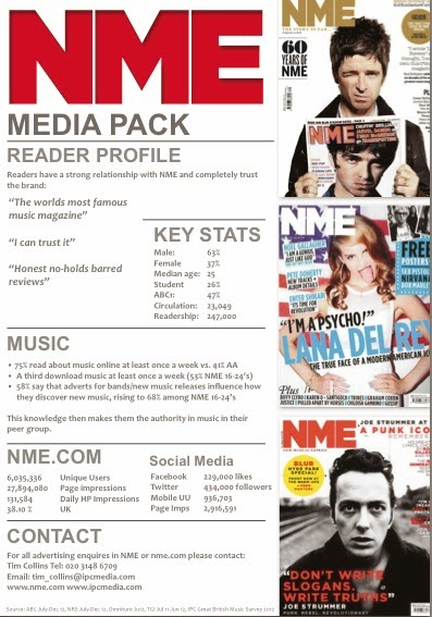
Create an audience profile similar to the NME press pack.


Once you have done this you will then need to  draft a questionnaire for homework.
this questionnaire should be a minimum of 10 questions and should allow you to collect information that will help you to construct your own magazine.  You might look at other examples on blog spot created by other students for ideas but do not just copy.   Remember that it needs to fit your ideas for your magazine and chosen genre.  You could use Survey Monkey to create your questionnaire and post links to it on your Facebook or twitter account.

CLICK THIS LINK Questionnaire example

Mainstream- the ideas, attitudes, or activities that are shared by most people and regarded as normal or conventional.  Appealing to a mass audience.  A magazine catering for all aspects of Pop music would appeal to a mainstream audience.

Niche- is a fraction of a total market or an audience. A segment of the market or the audience with highly specific needs and interests which cannot generally be satisfied by mainstream products.  A magazine focusing upon Dub step would be therefore be for a niche market.  

Monday, 31 October 2016

Music Magazine names and masthead ideas

Once you have selected your genre of music magazine then you will need to develop some ideas for the name of the magazine and then design a suitable masthead using appropriate fonts.  These will need to uploaded to your blog and show a range and variety.


Thursday, 20 October 2016

HALF-TERM HOMEWORK

You are to produce a detailed analysis of 2 music magazines.

You need to select two music magazines within the sub-genre you are considering constructing.

You then need to source images for each of the magazines of the magazine front cover, the contents page and a double page spread.  You could use google images or try going directly to the web page of the magazine.

You need to describe the magazines in detail.  Commenting upon:
  • Style of fonts, alignment and layout of text
  • Use of colour 
  • Style of imagery used
  • Content of images
  • How the images represent the subject content
  • Layout and composition of of text and images
  • Who publishes the magazine
  • The target audience of the magazine in terms of age, gender, interests etc.
  • What type of content is in the magazine
You need to present your research and analysis using a suitable format.  Such as Thinglink, Padlet, PREZI, Google slides or Emaze.

The deadline for completion of this task is Thursday 3rd November.

An example of one magazine analysis is below.


Wednesday, 19 October 2016

Contents pages Identify the key conventions and present examples.

Contents pages are designed as a reference to what is in a magazine.  They provide a brief overview of individual articles & features, some of which might be regular additions for every edition.  

The design and layout are based upon a grid structure that you must follow.  You must use rulers and gridlines to construct your ideas.  

They usually include a contents banner at the top of the page.  The masthead is also usually featured along with the date, issue number, web address and social media information.

They have 1 or 2 columns of text which have sub-headings.  

They use numbers to indicate the page location.  

They incorporate photos of the content with number and captions to provide anchorage, (creates a sense of meaning for an image).  The larger the photos the more important that article is.

Each article/ feature heading is in a larger/ bolder font for emphasis.

The blurb underneath is smaller and gives an indication of the content for that feature/ article.

There is often an editor's letter.  There can also be a callout box with magazine subscription information.  

The use of the text needs to be considered for emphasis and also needs to be a suitable size.  As a guide no larger than 24pt.  No smaller than 10pt.  If in doubt print and check.


Monday, 17 October 2016

Checklist for half term assessment

Please check your blogs to ensure you have all this work uploaded and completed by half term.  Your assessment will take place over half term and the first week back.  If you are unsure about any of the work you must ask.


Monday, 10 October 2016

Contents page layout sketches

You need to complete 6 x ideas for layout sketches for a contents page for your school magazine.
You will need to look at real contents pages for ideas.  Look at the examples of music magazine contents pages below to get you started.  

Your layout sketches need to be posted on your blog by Thursday 13/10/16.


Sunday, 9 October 2016

Rule of thirds hwk.

You need to research the photography composition technique 'the rule of thirds'.

This needs to be a blog post that uses key information in your own words and using the links provided below.  You must use visual examples wherever possible and reference the websites as sources at the bottom of your post.


http://digital-photography-school.com/rule-of-thirds/

http://learnprophotography.com/rule-of-thirds

http://www.ultimate-photo-tips.com/photography-rule-of-thirds.html

This needs to be completed by Thursday 20/10/16


Representation

REPRESENTATION ISSUES TO CONSIDER

•As you develop your research and ideas you will need to consider the representations exist within existing products and the representations that you will construct in your own products:

Representation in the media is concerned with how individual and groups of people, events and ideas are presented to audiences. What we see, hear and read in the media is a re-presentation of a subject it is not a real version of events it is constructed. Even a live broadcast is a representation, because you only see what is filmed by the camera operator. As a media studies student, it is important that you are able to identify and understand theserepresentations in the products and texts that you analyse and that you construct.

•You must show evidence of considering these representations in your own work and using them to construct your products and texts if you are to reach the higher grades.

Questions you must ask yourself about your own ideas    

•How have different genders been represented?
•How have different age groups been represented?
•How have different races or religions been represented?
•Have any other groups been represented? If so, why?
•Have any other groups been deliberately unrepresented? If so, why?
•How accurate is the representation? Is it positive or negative? Is it sympathetic or unsympathetic?  How is it intended to make the audience feel? Why?
•Can the representation be interpreted in different ways?  Explain how.
•How is the representation constructed and why?
•What effect does the representation have on the intended audience?
•You should consider the representation of men and women.
•You should consider the representation of good versus evil or of other binary oppositions at play in your narrative.
•How is the representation of ideologies portrayed?

Photography hints and tips

It is worth taking a look at this to get some basic tips to help you with your photo shoots.

You will need to take a lot of photos, from a variety of angles, with a variety of shots.

Don't forget to book a tripod out with me when you are ready.

Variety of costume, hair, make-up and props will also be very important.  As will backdrop, setting/ location and lighting.  DO NOT JUST TAKE SNAPSHOTS.

You will need to direct your subjects and ensure that they are posing for you the away you want.  Direct their body language, facial expressions as this will be key to constructing representations.

Remember the quality of your final products is dependent upon these photos so you must get it right.  Planning is the key to success.

Monday, 3 October 2016

Draft front cover example

Build the layers of your front cover in sketch.

Ensure you include the key conventions of:

  • masthead
  • headline
  • coverlines right and left alignment
  • date of issue
  • a pug
  • a main central image
You may add other elements if you wish but get feedback from me as you develop your ideas.

Use the example below to help you.


Photos to use for draft ideas for your school magazine


Sunday, 25 September 2016

Shot Types


Draft Front Cover for Plantsbrook School Magazine

Now you have developed some simple ideas on paper you now need to turn these into draft ideas using sketch. 

You need to plan the photos that you need to take;

  1. Who will be in them?
  2. Where will they be taken?
  3. What will they be doing?
  4. What is their facial expression/ body language like?
  5. What angle are you taking them from?
  6. What shot type do you intend to use?
  7. Do you need to ensure enough space to crop the image?  
  8. Does it need to be portrait or landscape?
  9. When will you take them?
  10. Who do you need to organise?
Is there anything else you can think of that needs consideration to help you? 

When you have taken your photos you will select suitable photos for the front cover drafts and then add the appropriate media language conforming to the conventions for a front cover.


Thursday, 22 September 2016

Thinglink- how to embed onto your blog

School Magazine Analysis

These are 3 examples of school magazines.  

Copy them and upload them to your blog.

Then.....

1. Identify the range of content that you can see in these magazines and any other appropriate content for a school magazine.
2. Identify who the target audience is for a school magazine.  Describe them in terms of demographics.
3. Analyse them in terms of denotation and connotation.


Monday, 19 September 2016

Preliminary Activity

As part of the Foundation Portfolio Coursework you must construct the front cover and contents page for a Plantsbrook School magazine.


  • You must identify the conventions of these media products.
  • You will identify who the target audience will be.
  • You must identify the type of content that would be included in this magazine.
  • You must develop ideas for names for the magazine.
  • You will develop ideas for the name and masthead for the magazine . 
  • You will develop layout sketches & rough ideas for the products.
  • You will plan a photo shoot and take appropriate photos.
  • You will produce the final products.
The deadline for this Preliminary Activity work is the 10th October.

Thursday, 15 September 2016

Research and analysis activity- Mastheads

Your first task is to complete your masthead analysis.


  1. Select 5 mastheads from music magazines
  2. Save them in your pictures
  3. Upload them to your blog
Then......


you will need to comment upon:

  • the use of fonts, style, colour, lowercase, uppercase etc.
  • the use of shadow, fills and lines/ strokes
  • the connotation of the word used for the masthead
  • any use of effects/ graphics
  • whether it sits in a banner, callout etc.
  • what type of magazine it is, genre(s) of music, type of content etc. (research their website)
  • who is their intended audience?  again research is key here, you will need to look at a range of sources to help you.
An example of a music magazine masthead