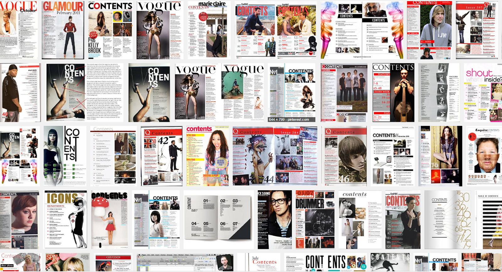
The design and layout are based upon a grid structure that you must follow. You must use rulers and gridlines to construct your ideas.
They usually include a contents banner at the top of the page. The masthead is also usually featured along with the date, issue number, web address and social media information.
They have 1 or 2 columns of text which have sub-headings.
They use numbers to indicate the page location.
They incorporate photos of the content with number and captions to provide anchorage, (creates a sense of meaning for an image). The larger the photos the more important that article is.
Each article/ feature heading is in a larger/ bolder font for emphasis.
The blurb underneath is smaller and gives an indication of the content for that feature/ article.
There is often an editor's letter. There can also be a callout box with magazine subscription information.
The use of the text needs to be considered for emphasis and also needs to be a suitable size. As a guide no larger than 24pt. No smaller than 10pt. If in doubt print and check.
No comments:
Post a Comment